UX/UI Case Study - Davis Cenntenial Seal - Brick Donnors

Kaelyn Syrdahl

kasyrdahl@ucdavis.edu

Project Overview

desktop veiw of website

This project is a responsive platform with an interactive map of the donated bricks surrounding the seal allowing donors to find the bricks that they donated. This project connects with the community aspect of the Davis Centennial Seal by showcasing the community members who contributed to the construction of the seal.

The primary goal of the project is to allow users to search for a name and be shown where that brick is located. The secondary goal is to provide an interactive map where users can click on certain bricks and see who else in the community has contributed to the bricks.

My target audience is long-time Davis residents aged 40 to 70 years of age. They will have lived in Davis long enough to have decided to donate money to the construction of the monument and be given a brick. They still live in Davis and frequently pass by the Centennial Seal to go to Mishkas.

Project Research

I conducted interviews of people from my target audience. In these interviews, I asked about their confidence with using technology and they indicated that they were fairly confident which was surprising to me because they are from an older audience. However, they did say they prefer to not use technology most of the time. This made me realize how important it is that I make the website simple and quick to use.

If I create something that is too complicated or has too many options they are more likely to give up on the website, than someone who uses technology often and might prefer more options. I originally had planned to add extra information about each brick to the website, but decided to simplify it to only display what is written on the brick so my target audience would be more likely to use the website.

Visual Design

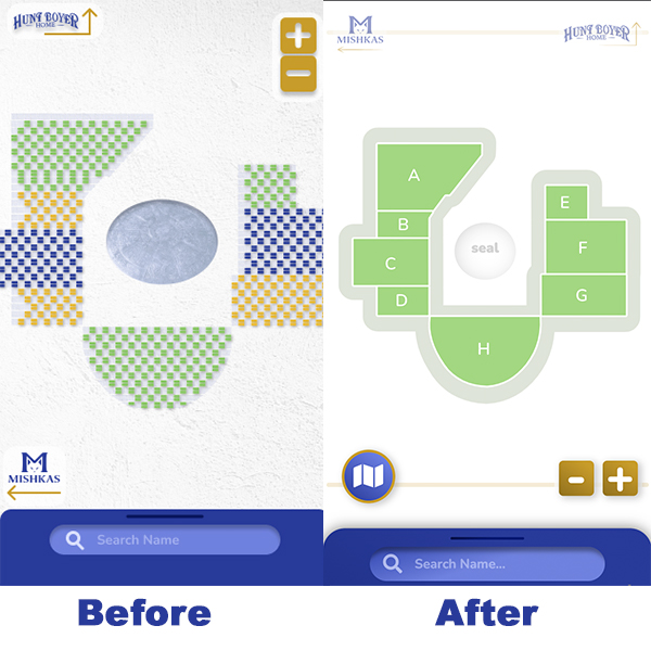
before and after of brick map

During my target audience interviews, I also learned that one thing the brick donnors have in common is their love for Davis. As a result, I tried to reflect Davis in my color choices. I picked colors that were consistent with the City of Davis website, blue, green, and golden yellow. For my font choices I wanted something welcoming, but still professional so I picked Nuito because it is clean, but has rounded edges which can be seen as more welcoming.

One of the main changes I made from my original design was the map. I originally displayed all of the individual bricks in the map when the webpage was first opened. However, I received feedback that this was overwhelming. To make the map less overwhelming, I started the design with blocked out sections for the bricks and when the user clicks on one of the sections, then the individual bricks appear.

Tasks For Users

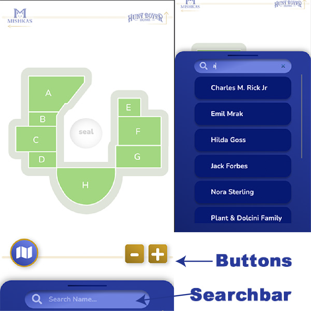
Since my website is mostly made to be used for mobile, I positioned all of the clickable buttons at the bottom of the page. This is because when users are holding their phone they hold it from the bottom so elements at the bottom are easier to reach. Most users are right handed so the easiest access will be on the right hand side. As a result, I put the button they are likely to click the most on the bottom right.

close up of search bar and scale buttons

I added a search bar to the bottom of the page to make user interactions easier. I could have created a seperate overlay where users could search for their name in alphabetical order, however, if I had done this there was a chance that the users would have given up before they found their name. It is known in psychology that the easier you make interactions the more likely user are to interact.

Usability Testing & Further Development

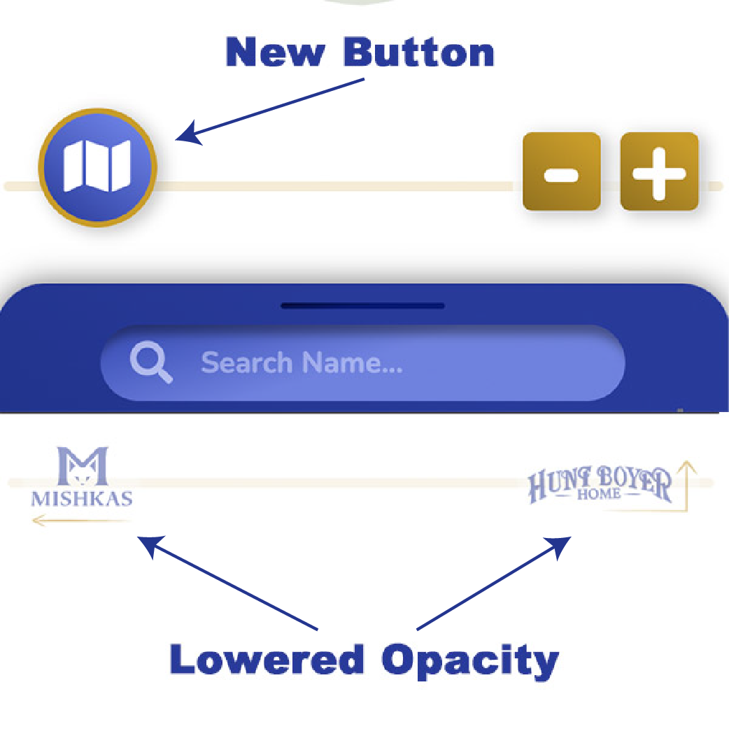
While doing user testing, I noticed that I didn't have a way for users to return to the main map, so I added a button that would bring you back to the homescreen. Then, for the search bar, I noticed that both of my testers first went to the list of names in the search, instead of typing in the search bar, so I made sure the names were listed alphabetically in case they wanted to search there instead.

I also noticed that people are drawn to clicking on the Mishkas and Hunt Boyer Home logo. I was worried about this because it does have similar characteristics to a button. To solve this issue, I lowered the opacity of these two elements so they blend in more to the background and look less like a clickable button.

close up of button with map and lowered opacity of mishkas and hunt boyer home logos

Summary

This project was big challenge for me and I knew it would be, but I wanted to chanllenge myself. I think my strong suit in website design is my addition of illustrations, so I picked this project specifically because I knew there would be hardly any illustrations and would instead force me to focus on JavaScript.

I learned so much about JavaScript and how to use JSON files with this project. I pushed myself to use JSON to populate the search bar and other parts of the HTML and I actually got it to work. Even though everything is not as polished as it could be, I am still extremely proud of everything I acomplished in this project especially with the JavaScript.

This project is meant to be a stepping stone for someone else to continue working on, so it's alright that it is still a work in progress. I am looking forward to seeing how the next person alters my code and design to make it even better.

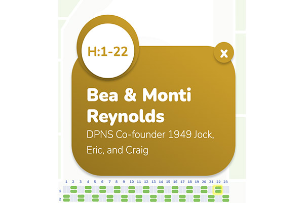
collage of three images, close up of the overlay, fullscreen in mobile, and close up of the search bar