Comparitive Analysis

School Funding
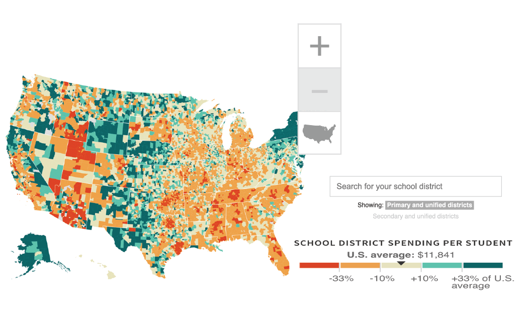
This is an interactive map that NPR created. It shows a map of the United States and color coordinates each school district based on the funding it gets per child, compared to the national average. The interface is really clean but currently the map is too small to view; however, I know it used to be bigger. Something I think they could have improved is to have more of a separation between the districts so you know they are separate clickable elements.

The Witcher
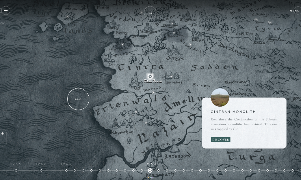
This is an interactive map based on the fantasy world from the Witcher. It allows you to click on and scroll through different areas of the map to learn more information about the world. I like how there is continuous animation, making the map feel more fantastical. However, something I think would have been an improvedment is if they had added a pop of color for the clickable elements. Currently the color blends into the rest of the drawings on the map and it's difficult to locate the interactive elements.